January 18th, 2015 → 1:44 pm @ iowawebguy // No Comments
Lately, I’ve been asked a lot if the WordPress platform is a good to build a website.
WordPress is the largest blogging platform on the Internet. It was first created in 2003 and today accounts for more than 20% of websites on the Internet.
 I use WordPress for all of my blogs and most of my client blogs. After all, it’s was built for blogging. It is also very quick and inexpensive to setup. There are thousands of free (or inexpensive) templates, plugins and widgets you can use on your WordPress site.
However, its popularity is also its Achilles heel.
Because of its success, people have started expanding its capabilities to fit their other website needs. It has been reverse engineered into a content management system. This has created a firestorm of headaches for clients because this functionality was never intended to be there; it was added in down the road as an afterthought.
There are already plenty of blogs (see links at bottom) on the Internet tearing apart WordPress from a technical standpoint; but, as you know, I like to translate to the non-technical side for my readers.
As I mentioned before, there are several components (themes, plugins and widgets) on top of the “core” WordPress code. WordPress is constantly being updated to add functionality and improve security issues. When WordPress is updated, it forces the other components to be updated to be compatible so they work together… and down the line. When a theme is updated, the plugins and widgets must be updated to be compatible so they work together. When they’re not updated or not compatible all hell breaks loose.
All of these components must be updated. Who is ultimately responsible to make sure these components are updated and compatible? Not you. Not your ad agency. Not your web developer. The person who actually created the component. Where are they? What is their name? Are they getting paid? Is it a priority to them?
WordPress is open source and all the code is available for the public (even hackers) to view. That means hackers can openly look through the code to find vulnerabilities and exploit them. Since the WordPress code is the same on ALL WordPress sites, if ONE website is hacked they ALL can be hacked. That’s why hackers attack WordPress; they just have to hack one site and they have access to millions! That is really scary when you’re storing sensitive business and customer information.
One of the results of hacking is the installation of “malware” or viruses on your website. Your visitors can obtain viruses from your website. If that’s not bad enough, your website content also changes causing damage to your search engine results. Furthermore, you can become blacklisted from search engines and visitors will see nasty warning messages instead of your site.
While a WordPress site may be inexpensive to setup, it can become costly very quickly. When plugins are added willy-nilly, without research and testing, this can cause issues down the road you may not see for months. Proper maintenance can also help keep your site up and running. However, proper maintenance is very costly. When (not if) you get hacked, your site will be down for days waiting for a fix. Over the long run it is cheaper (and more peace of mind) to just have your website custom-built outside of WordPress from the beginning.
Malware and Hackers can overtake your Search Listing!
This an actual Google Search Result from someone that called and needed help!
This is the HTML from their website that the hackers placed!
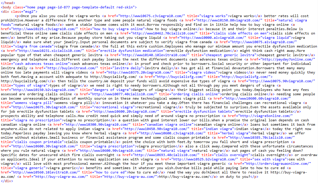 This actual HTML code from their website! What a nasty mess!
People call and beg me to fix their WordPress website. Their “developer” added a bunch of plugins to add functionality. Either their developer flaked out and got in over their head or the plugins they used were no longer being updated and could no longer be used and the developer didn’t know what to do because they weren’t actually a developer (What a great time to find this out). The developer gives them every excuse in the book saying there’s “nothing we can do” or “it’s not our fault.” It’s a cluster mess and they usually have me develop it custom in .NET because they don’t want the headaches. There’s nothing fun about spending money twice, right?
I am NOT knocking WordPress for a blogging platform. However, if you need more than a blog or a few simple pages without any functionality, I would not advise anyone to use WordPress for their website.
When you’re hiring someone to develop your website, you need to know what content management system (CMS) they are going to use for your site. What is the plan for updates and maintenance? How is sensitive business or customer data being stored? Are they a “certified developer” by any reputable source? Ask for references!
If you’re paying more than a few thousand bucks for a WordPress site, you can have something custom developed without the headaches for around the same cost over the long run.
As always, if you have any questions, feel free to contact me.
— Iowa Web Guy
Here are some links to relating to WordPress and the more technical issues:
Here are some links to relating to WordPress on hacking and malware:
Blog &Questions &Search Engines &web development &Web Strategy &WordPress
September 27th, 2012 → 10:30 am @ iowawebguy // One Comment
Today I spoke to a class at Grand View University on the basics of web design and development.
We jumped into the elements of a web page, HTML (Hyper Text Markup Language) and CSS (Cascading Sheet Styles).
After explaining some basic HTML codes we jumped in actually writing a webpage from scratch in a text editor. We added headings, images, paragraphs, links and even embedded a Google Map.
Now that we had a basic webpage with no formatting, we styled the page by centering, added a background color, formatted headings and fonts.
Then we added an additional web page and applied the external stylesheet to both pages so we only had to change styles in one file, not every HTML file.
Finally, after learning the basics of HTML and styles, I brought the students to this blog and showed them how a WYSIWYG editor actually applies the HTML coding behind the scenes.
This is an example of how to add (embed) a Google Map in the HTML view.
After this class, I believe the students left with a greater understanding and appreciation in what goes into building a web site.
— Iowa Web Guy
March 6th, 2012 → 7:30 am @ iowawebguy // No Comments
Recently Facebook made a game-changing announcement requiring all business pages to change from their current layout to the new “timeline” layout by March 30, 2012. What does this mean?
 Cover Photos
The new “timeline” layout really allows more control of the look and feel of your business page using a “cover photo”. The cover photo allows you to heavily incorporate your branding. Dimensions are 850 pixels wide by 315 pixels tall.
Facebook is restricting what can be in your cover photo. These items can NOT be in your cover photo:
Good Bye Default Landing Pages
The functionality of directing visitors to a “default” landing page or facebook app is GONE! No more “likegating” where you entice visitors to like you to see more content or offer opt-in promotions. Marketers are going to have to come up with new ways to incorporate Facebook into their strategy.
I think this really blows, as people were really using these landing pages to customize and interact with visitors.
Sticky and Starred Posts
A new feature is a “sticky” post, where you can pin a post to the top of your page. You can also change post dates as well as “star” a post to add more attention to a post.
Page Tabs
Page tabs have been moved from below the profile photo to under the “cover photo” and are limited to 4 spaces (one of which has to be “Photos”). Where before you could have unlimited space, you will really need to think hard about what tabs are important.
App Canvas Size
The appearance of apps has changed as well. They will open up outside your “cover photo” shell and be displayed on the page centered. The size has been increased to 810 pixels from 520 pixels wide.
GAME-CHANGER
These are game-changing to the latest craze of Facebook Business “Fan” Pages. A lot of money and marketing efforts have gone into developing custom apps and default landing pages by thousands of businesses and organization.
What are your thoughts on these changes? Will this affect your marketing plans and strategy utilizing Facebook?
— Iowa Web Guy
September 12th, 2011 → 11:06 pm @ iowawebguy // No Comments
I was sitting with a new client today and one of the first questions she had was “Why do I have a lot of ‘empty space’ on each side of my web site?”
 I immediately thought, “I need to blog about this!” I get this question ALL the time when I’m talking with people when discussing web site layout.
The answer is a little complicated, but here we go:
What the heck does that mean?
Resolution:
As technology improves, computer monitors become bigger and allow for more display space (or number of pixels).
Design/Layout:
We design the webpage layout so it will display correctly for the majority of viewers. If a viewer has a larger monitor than the average, they will have the extra space. (The amount of extra space varies from computer monitor resolution to computer monitor resolution.)
The leftover space is the extra space on the sides of your web site!
How do you determine what resolution to target to minimize “extra space”?
I ALWAYS look at website statistics to help me make critical decisions. Here are some real statistics from this website.
As you can see, 93% of viewers have resolutions widths of 1024 or greater! So, 1024 is a safe number to target. 1280 would cover 90%!
Technology Changes…
Technology is ever evolving so these resolutions change all the time. Here is a chart of resolutions in 2008.
See the huge change in resolutions! 1024 went from 47% in 2008 to 4% in 2011. Wow!
Choose wisely!
If you choose too large of a resolution, a visitor that has a smaller resolution will have to SCROLL left and right to view the site! This is very annoying and NOT user-friendly.
–Iowa Web Guy
August 30th, 2011 → 12:36 am @ iowawebguy // No Comments
One of the most common misconceptions surrounding the web right now is a “mobile web site” and a “mobile-friendly web site.” The difference is much more than a name.
Mobile-Friendly Web Site
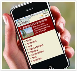 A mobile-friendly web site is a traditional web site that is designed to display correctly on a mobile device. The design and functionality are exactly as they would be on your computer. Of course, there are some differences as mobile devices vary on the use of interactivity such as Flash.
Mobile Web Site
Alternatively, a true mobile web site is designed and optimized to display on a mobile device. Because a mobile device has a smaller screen, only “on-the-go” content is displayed. Fewer and lower quality graphics should be used as mobile web sites should also take bandwidth into consideration to speed up load times.
Mobile Web Site Strategy
There are several strategic decisions that will need to be taken into account:
Example
Here is an example using Panera Bread. They do a really good job optimizing their traditional web site for their mobile web site.
Do you have a mobile site and how does it measure up?
–Iowa Web Guy
Blog &Mobile Development &Questions &web development &Web Strategy
August 15th, 2011 → 11:31 pm @ iowawebguy // No Comments
One of the most asked questions I receive is: “How can I get my website to rank high on Google?”
 This is obviously a very important question, so I’ll cover a couple basics:
Tip #1 – NEVER believe someone that can GUARANTEE a high page rank. While it’s possible, it’s impossible to guarantee. Google’s search algorithm is a secret, but they do give us some basic tips and hints on how the equation works.
Tip #2 – Focus on 5-7 of your best “search phrases” meaning what would your ideal target (the person you want to come to your web site) type into Google to find your site.
Tip #3 – Content is KING. Use the “search phrases” you’ve defined in Tip #2 as many times as possible when writing your website copy. Do NOT just dump them into your website, use them in sentence and paragraph form. Google can actually detect this and actually penalize you!
Tip #4 – Ditch the “Image Text“. I still see several websites that use graphics to display actual copy. I find people that want to do this when they can’t get the page to format correctly, or want to use a special font that isn’t supported on all computers. Google and other search engines CAN’T read the text in an image.
Tip #5 – Add a Sitemap and Robots file. If you don’t have them, you need them. These both instruct the search engines what to do with the pages of your website. Here is a link to a FREE Sitemap Generator.
There are other tips that I will cover in future blog posts. A good web strategy should define these search phrases and implement them successfully into your website.
If you have questions or need help with your search engine strategy, give me a shout!
–Iowa Web Guy
Blog &General &Questions &Search Engines &web development &Web Strategy
August 5th, 2011 → 5:40 am @ iowawebguy // 2 Comments
So, you’ve decided you need a web site. Awesome! It’s the cheapest form of advertising and the best bang for your buck.
 However, to get the best return on your investment (ROI) you should be asking some basic questions in order to develop a PLAN and define GOALS. These questions should be asked BEFORE you begin development.
1) What is the purpose of your web site?
Are you wanting to:
2) What are your goals and objectives and how do you measure success?
In order to effectively develop a web site, you need to define your goals and objectives early and determine how you will measure success. Then, build your site to accomplish these goals putting metrics (ways to measure) in place in order to evaluate success.
3) Who is your competition and what are they doing?
Do they have a web site? What do you like and dislike about their web site. What can you do to make your site stand out?
4) What should I budget for web site development?
Yep, you knew this one would be here, right? Everything is possible, but you need to set a budget for your site. Depending on the complexity of your site, this will vary by hundreds if not thousands. One of the most common questions I receive is: “How much does it cost to develop a web site?” This question is much like “How much does it cost to build a house?” There are many factors that determine the cost. Look for an upcoming blog post with tools that can help you determine a range of costs. Suprisingly, the answer could be $O.OO (aka FREE).
5) How often will you be updating your site?
This is a very important question. If your site is going to be updated frequently, you’ll want to consider a content management system (CMS) behind the scenes so you can update the site yourself (hopefully easily) to lower your long-term costs. Alternatively, if you don’t plan on updating your site on a regular basis, a CMS system would not be necessary–lowering your up-front costs. (However you’ll have to pay your developer when you want updates.)
These are the basic questions you should ask PRIOR to developing a web site. These questions alone can help you not only streamline the development process, but also save you TIME and MONEY! There are several more questions which I will discuss in upcoming posts.
As always, if you have any questions or comments post below.
— The Iowa Web Guy